Phase 1: Conception of the greatest show in College Park
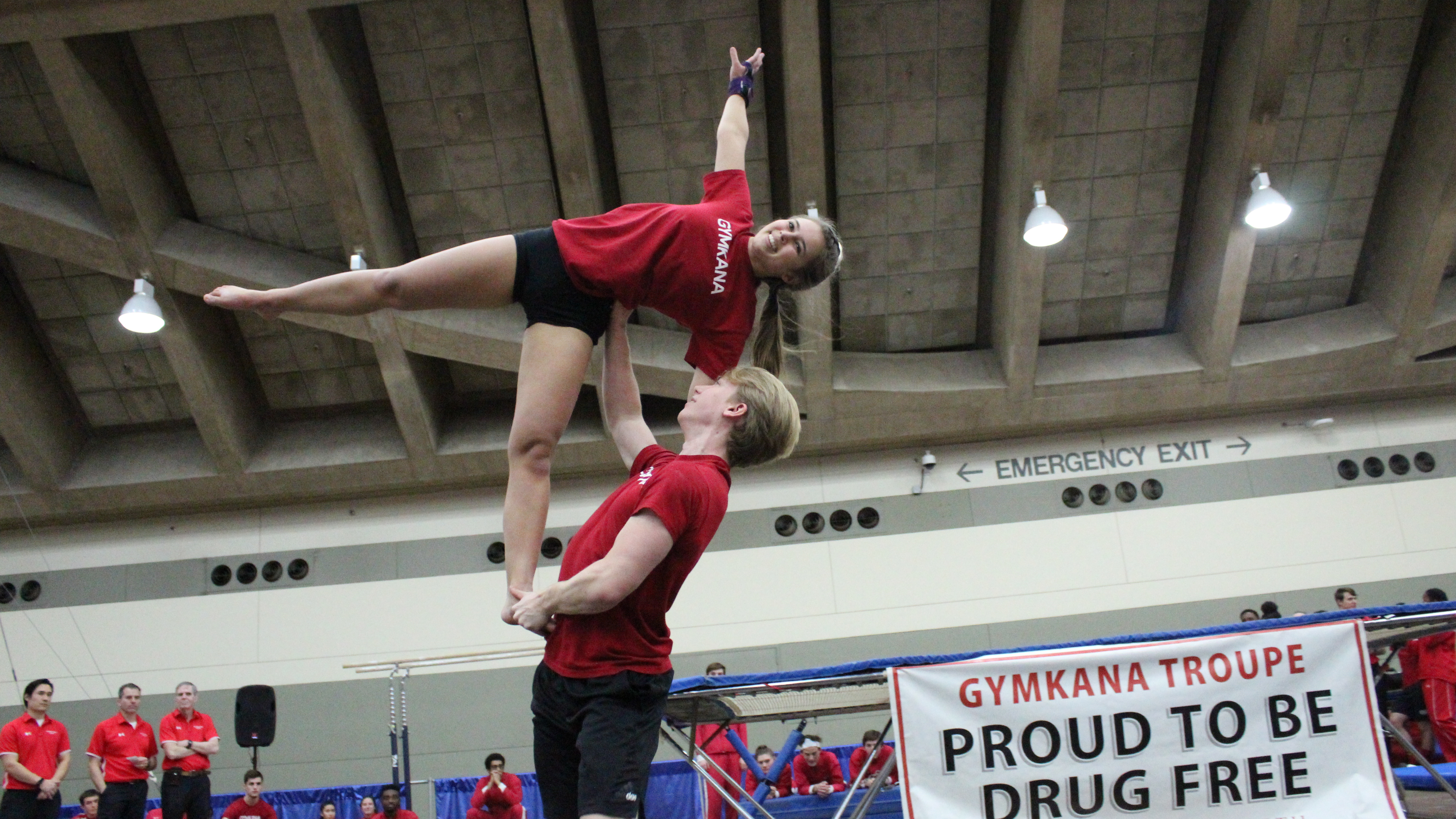
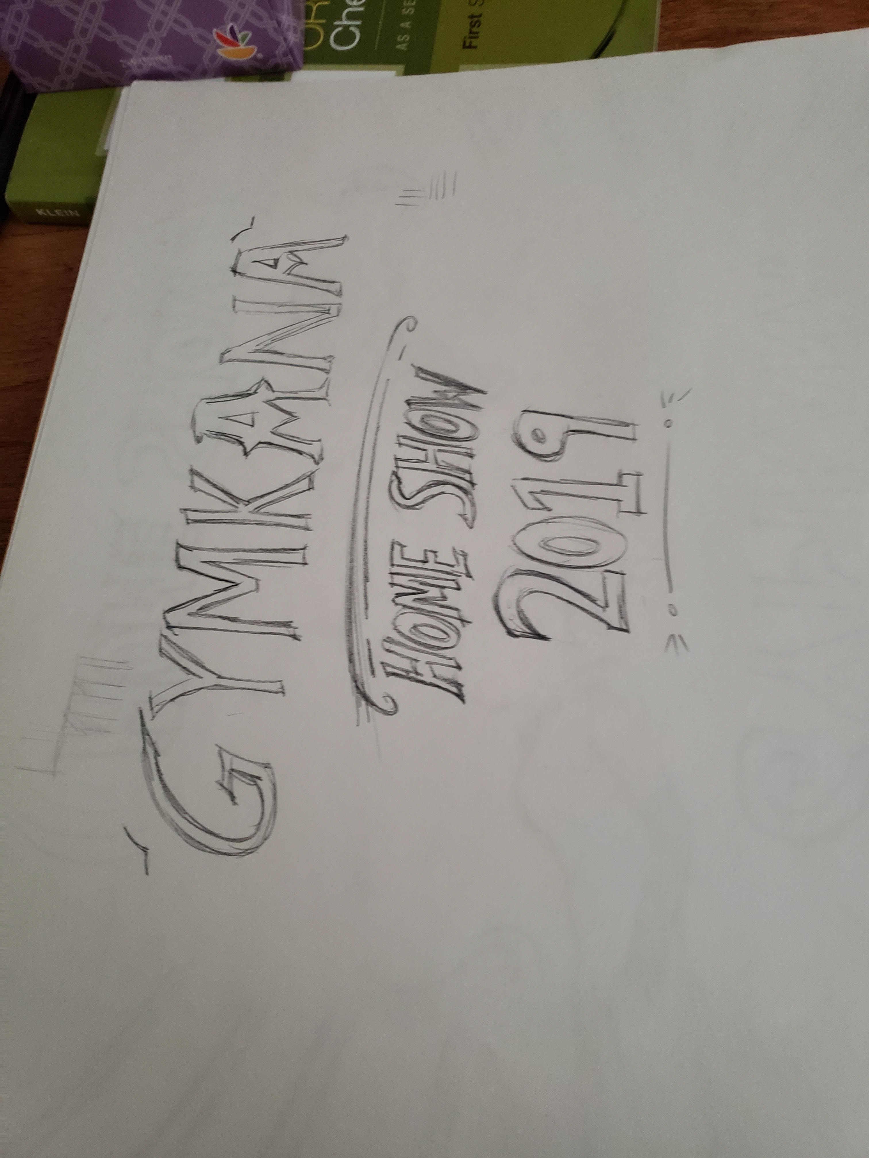
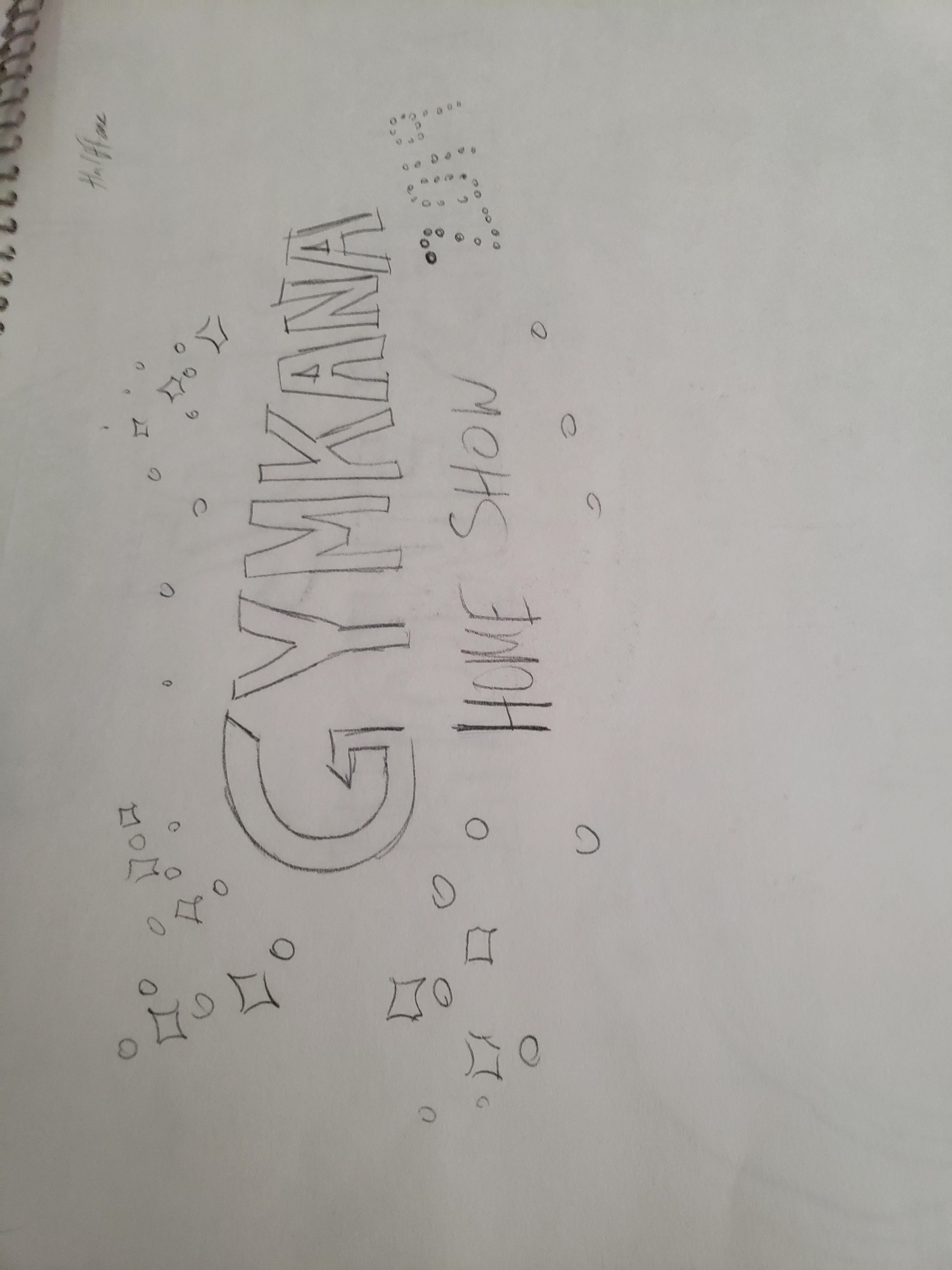
- After listening to the Greatest Showman soundtrack on repeat, and sketching endlessly for ideas for Home Show, I finally decided, "What if we brought the circus back to Gymkana?" For context, Gymkana is a gymnastics-acrobatics performance team that bases our performances off of circus acts, combined with other novelty acts. (Think Cirque Du Soliel, but smaller scale performed by college students at the University of Maryland). Anyways, Gymkana was a lot more circus-y back in the day, but as time went on, other themes began to take root. I decided to lean heavily into the circus trope, with bright and bold colors, flashy elements such as speckles and sunburst patterns, and continuing to use Gymkana trouper silhouettes, and the line pattern elements used in the previous semester.

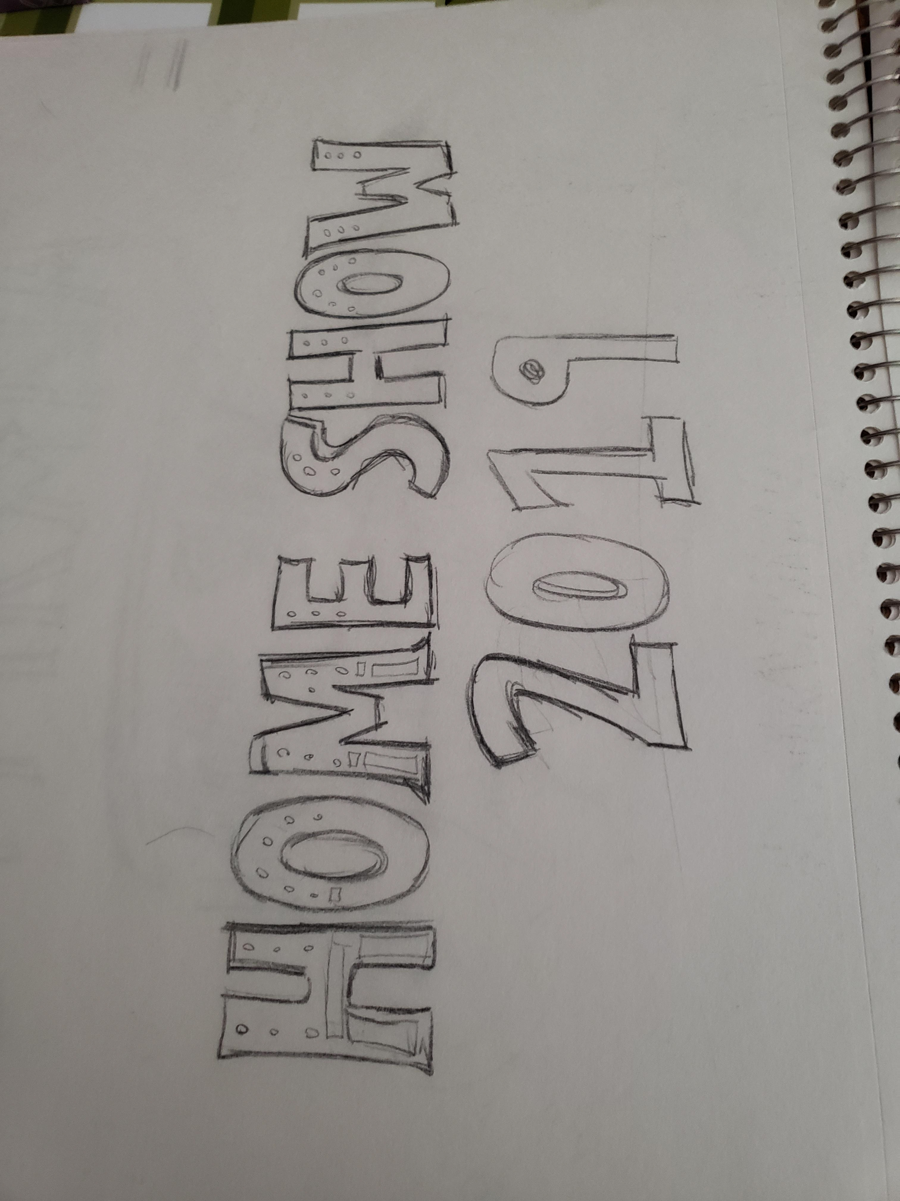
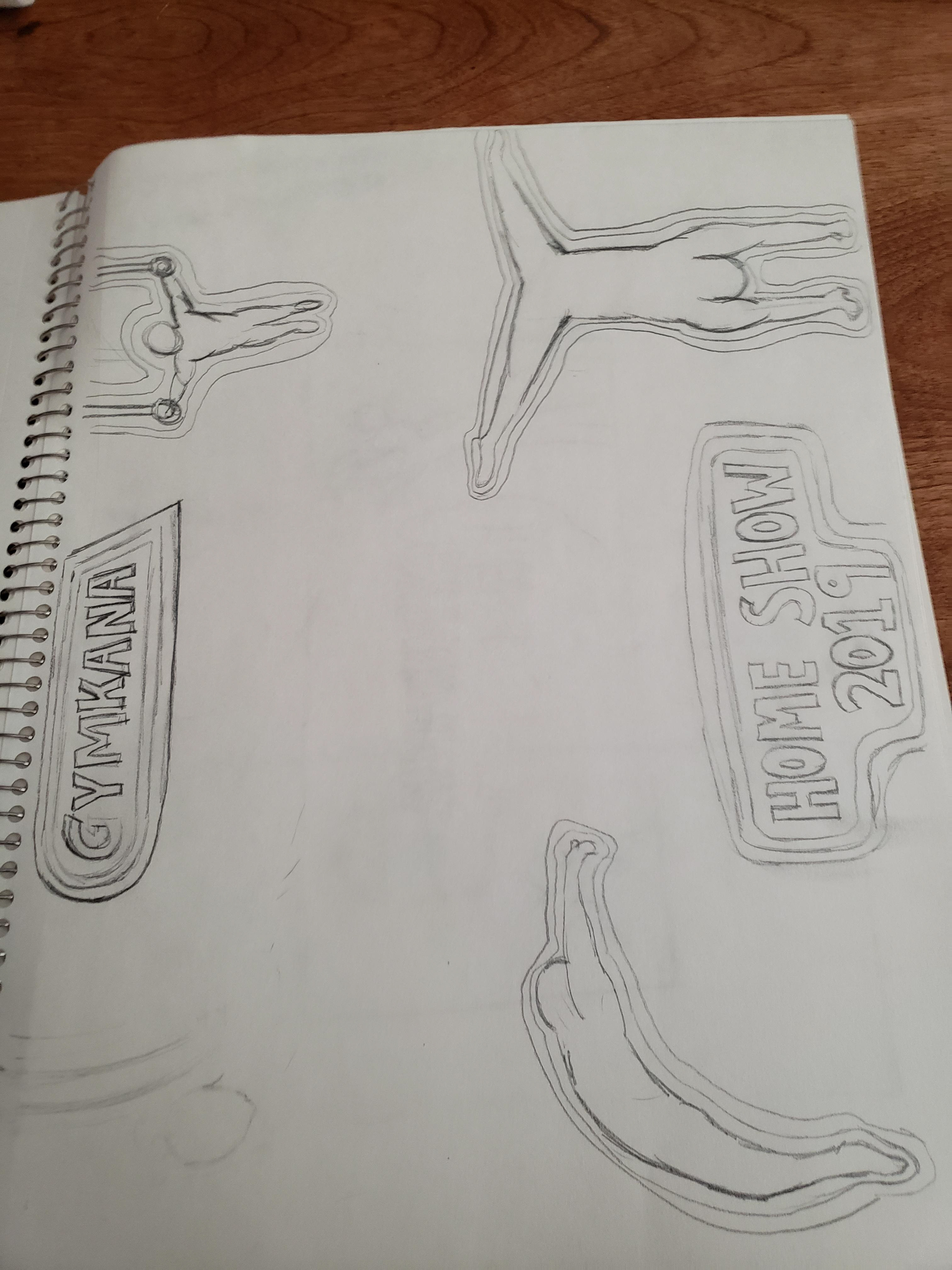

Phase 2: Digital Drafts
After sketching out a compilation of circus-themed ideas, it was time to digitally bring this design to life. The images below show the progression of the design, leading up to the penultimate design for the show.
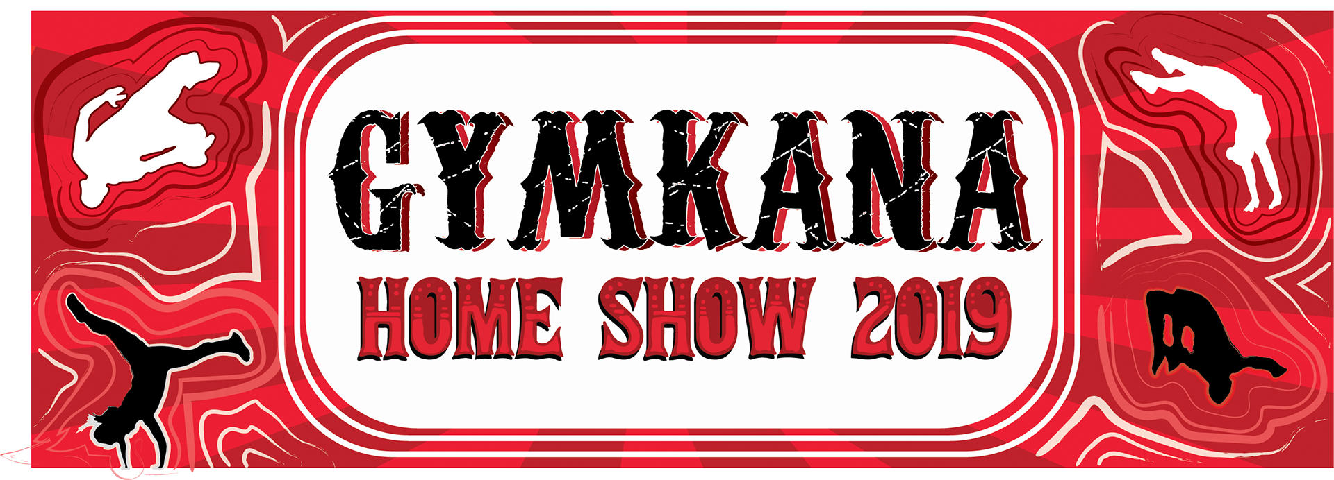
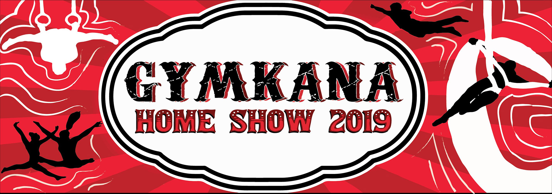
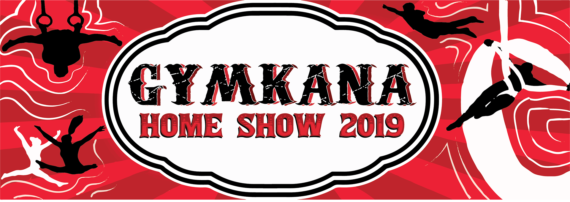


Home Show 2019 Backdrop
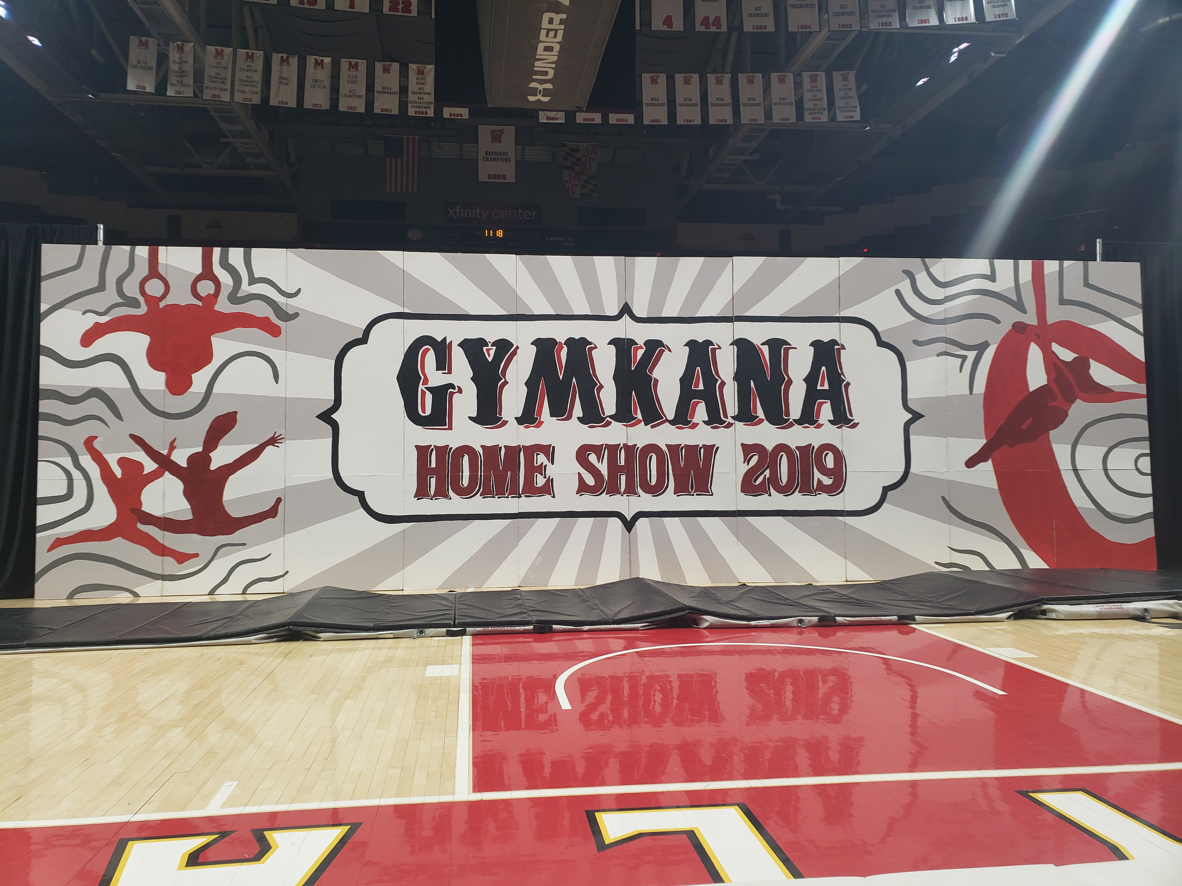
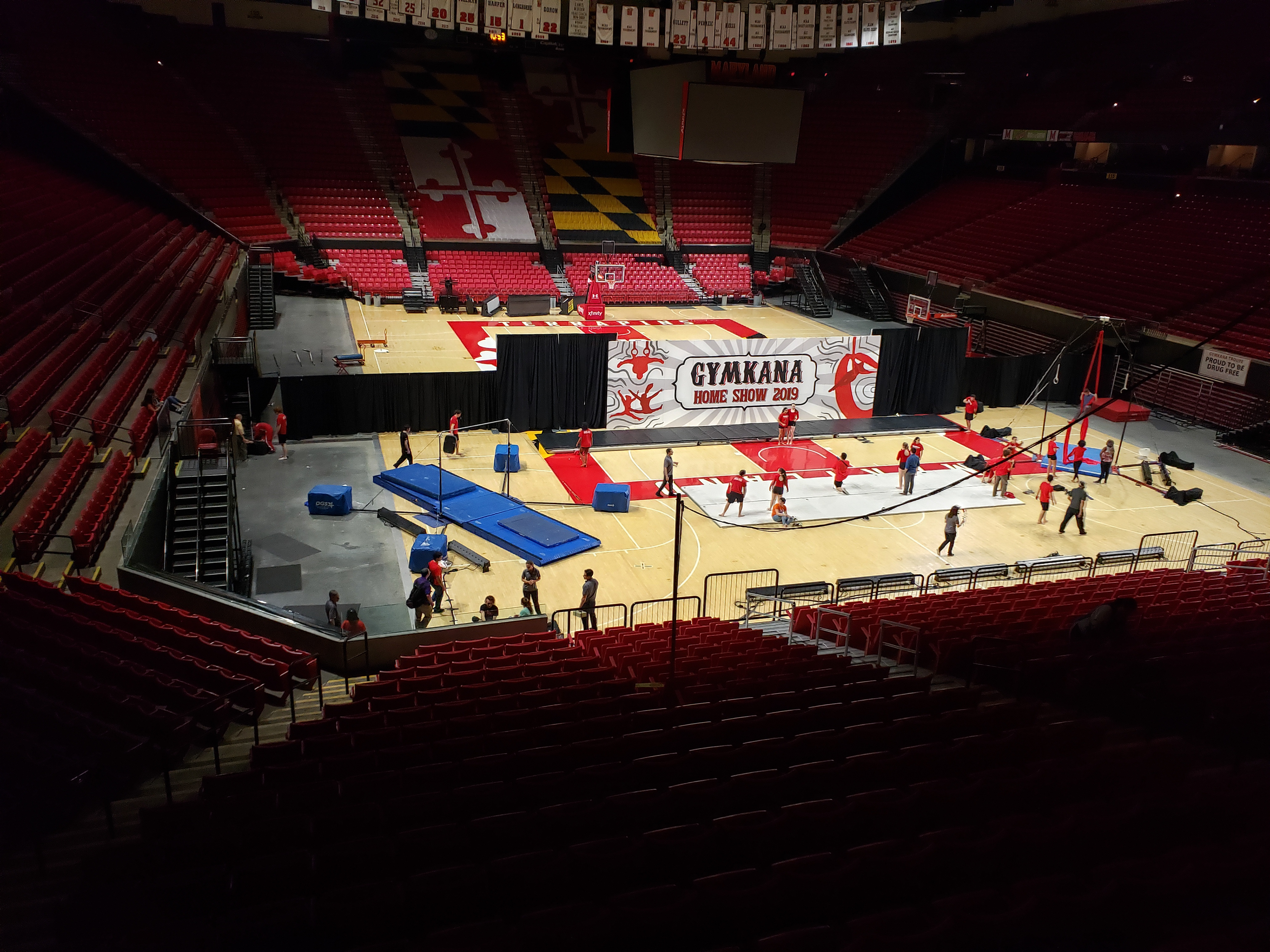
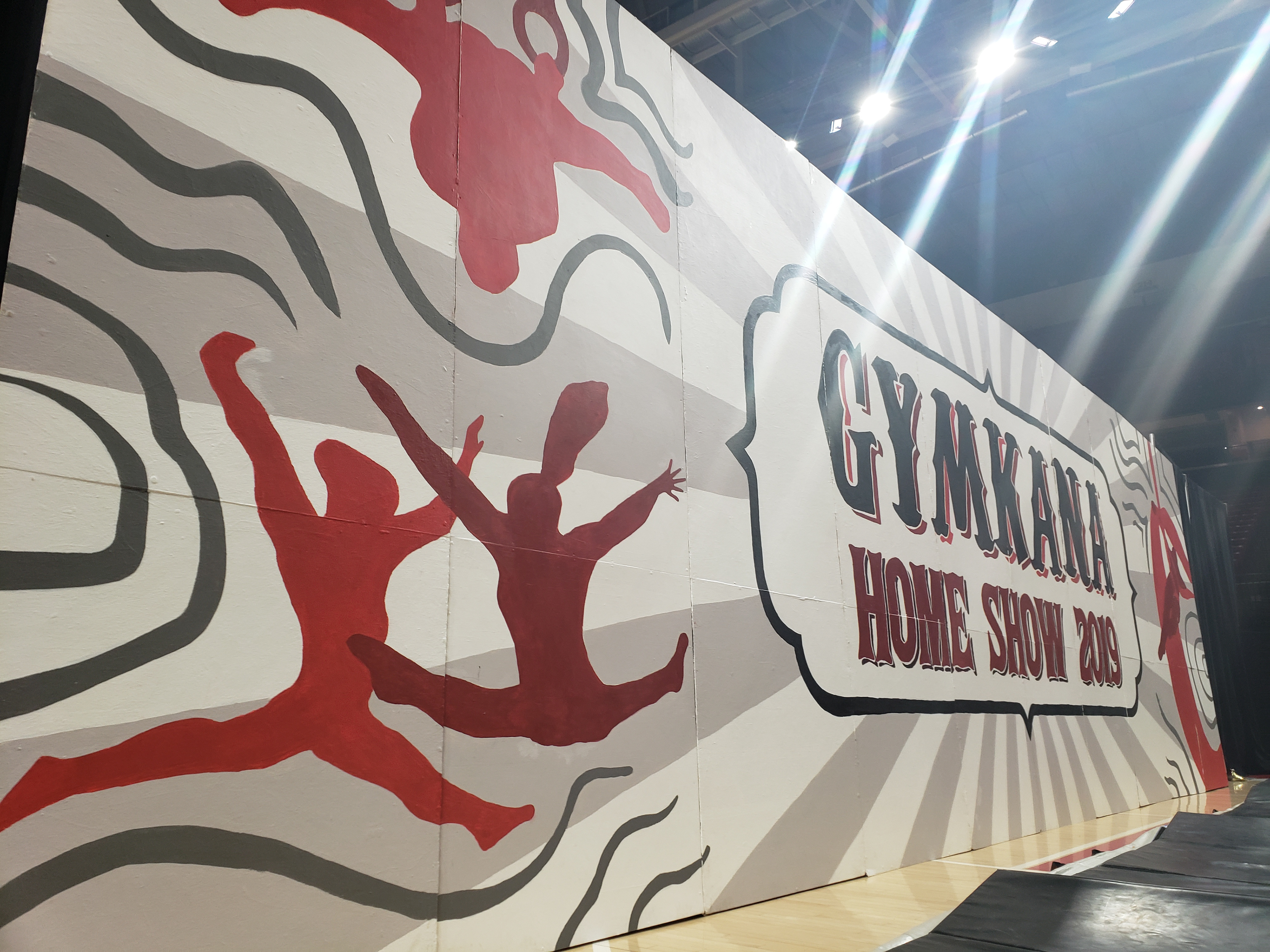
Every backdrop has to be reflective, since it sits in the background of the show in the Xfinity Center. My original proposed design was the red/maroon sunburst backdrop, but the Gymkana president and the Assistant Director needed the design to be even lighter to be more reflective for the show. Thus, the final colors ended up with the white/silver sunburst pattern, with red/maroon silhouettes and lines. Admittedly, I preferred the red design because of how striking and bold it was, but over time, I've come to appreciate this design, and it is one of my all-time favorite designs that I've produced.

Phase 3: Home Show Promotional Materials
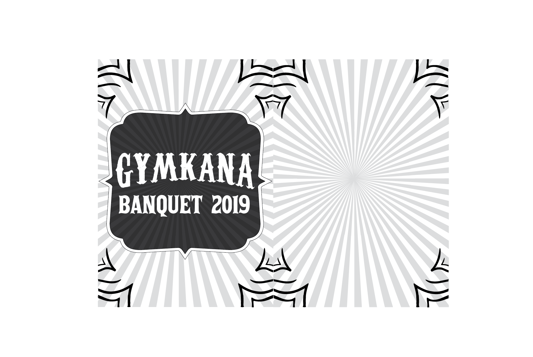
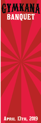
With the backdrop design finalized, the next step was create various graphics to promote the show. This included digital flyer graphics, digital banners, printed program designs, and my favorite--T-shirt designs. This one was extra special because this was the first design in a few years to incorporate a full back design on the shirt.

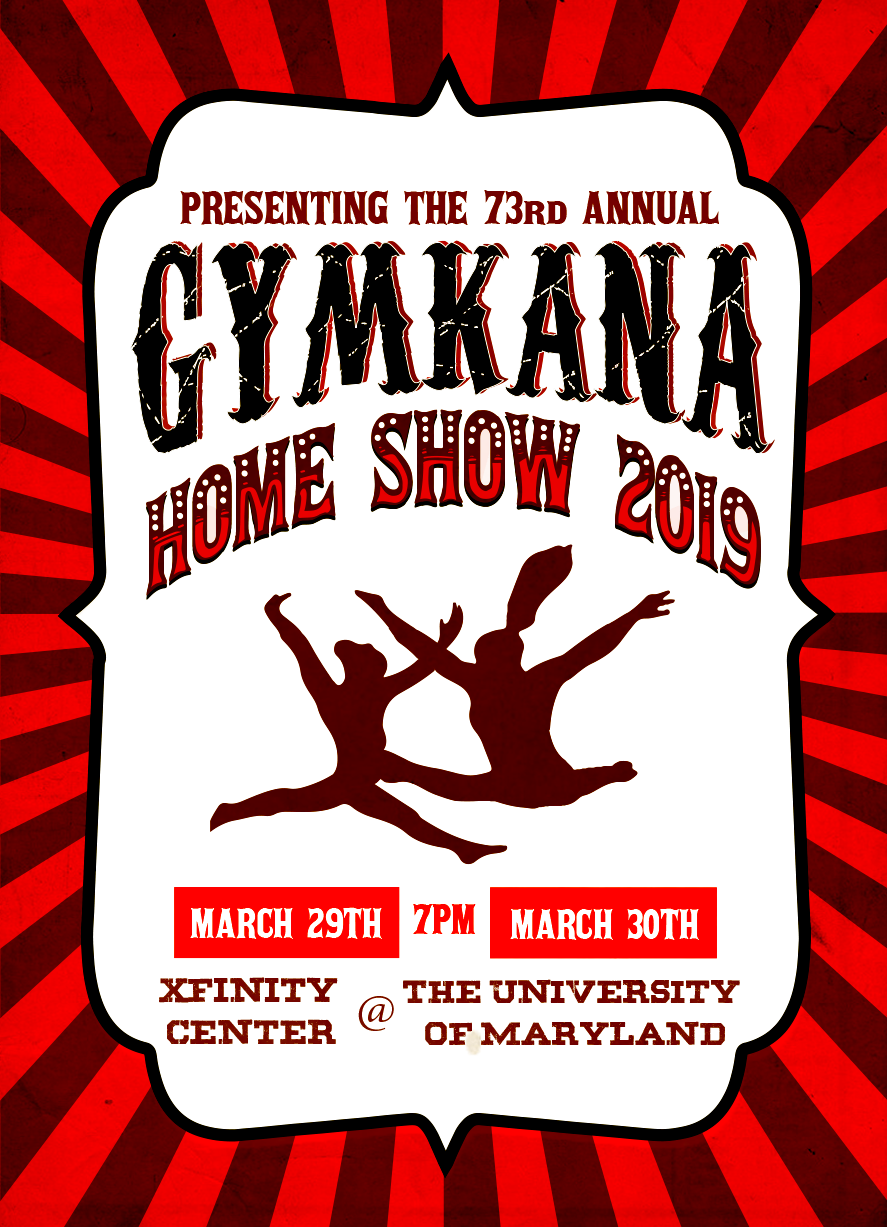
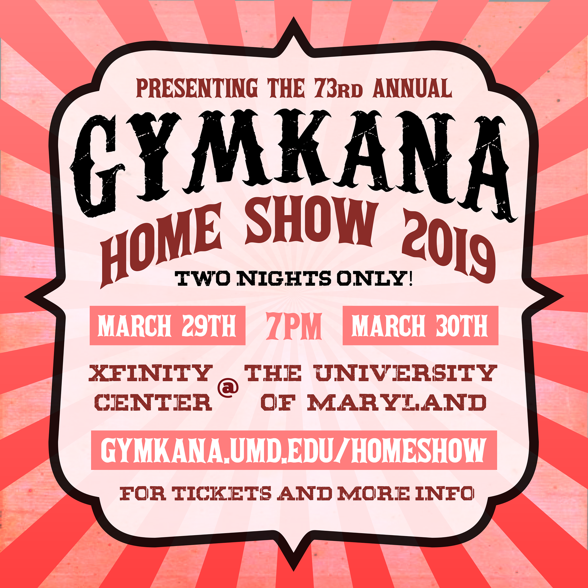
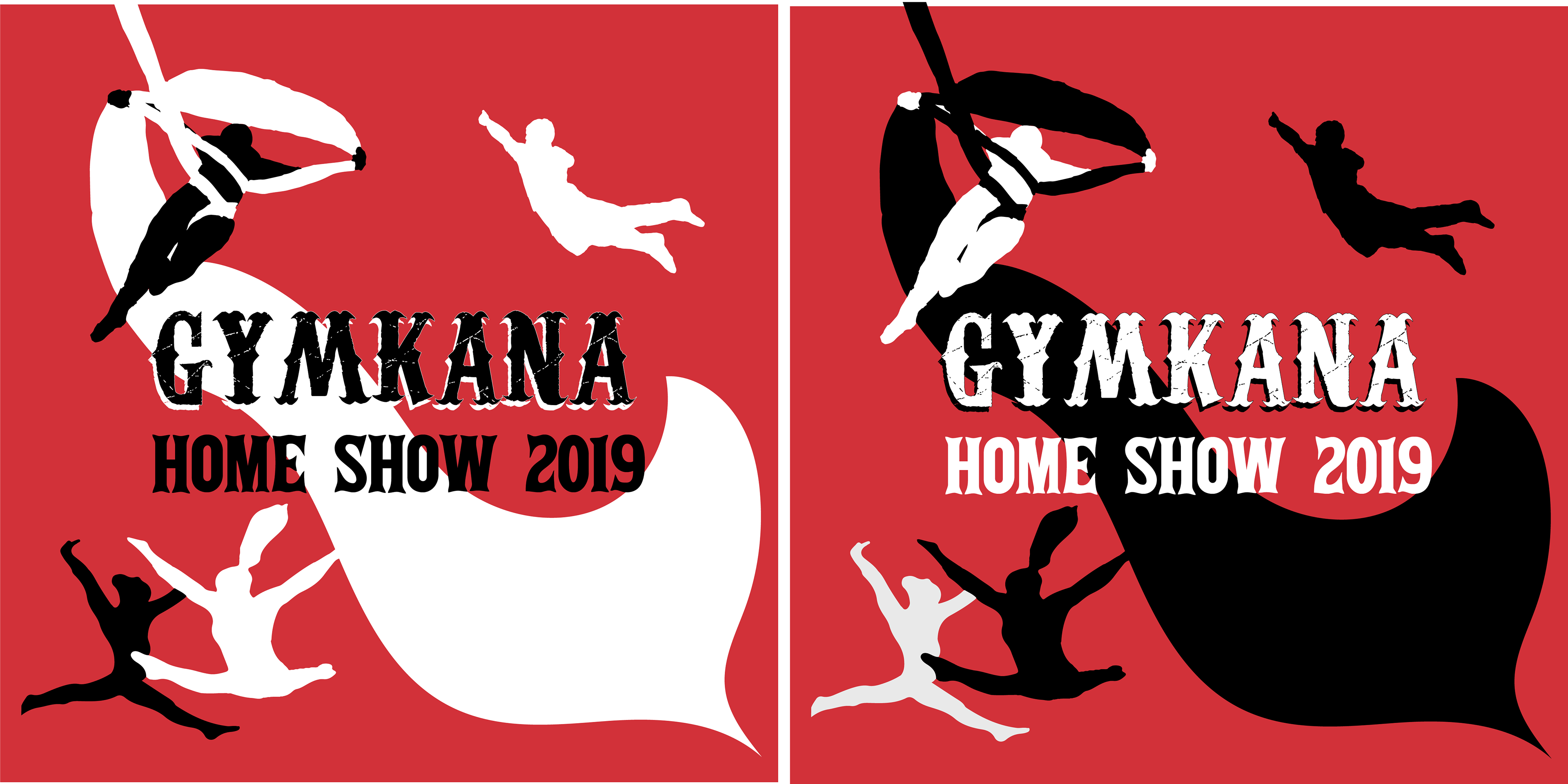
Home Show 2019 T-Shirt Designs (Front)
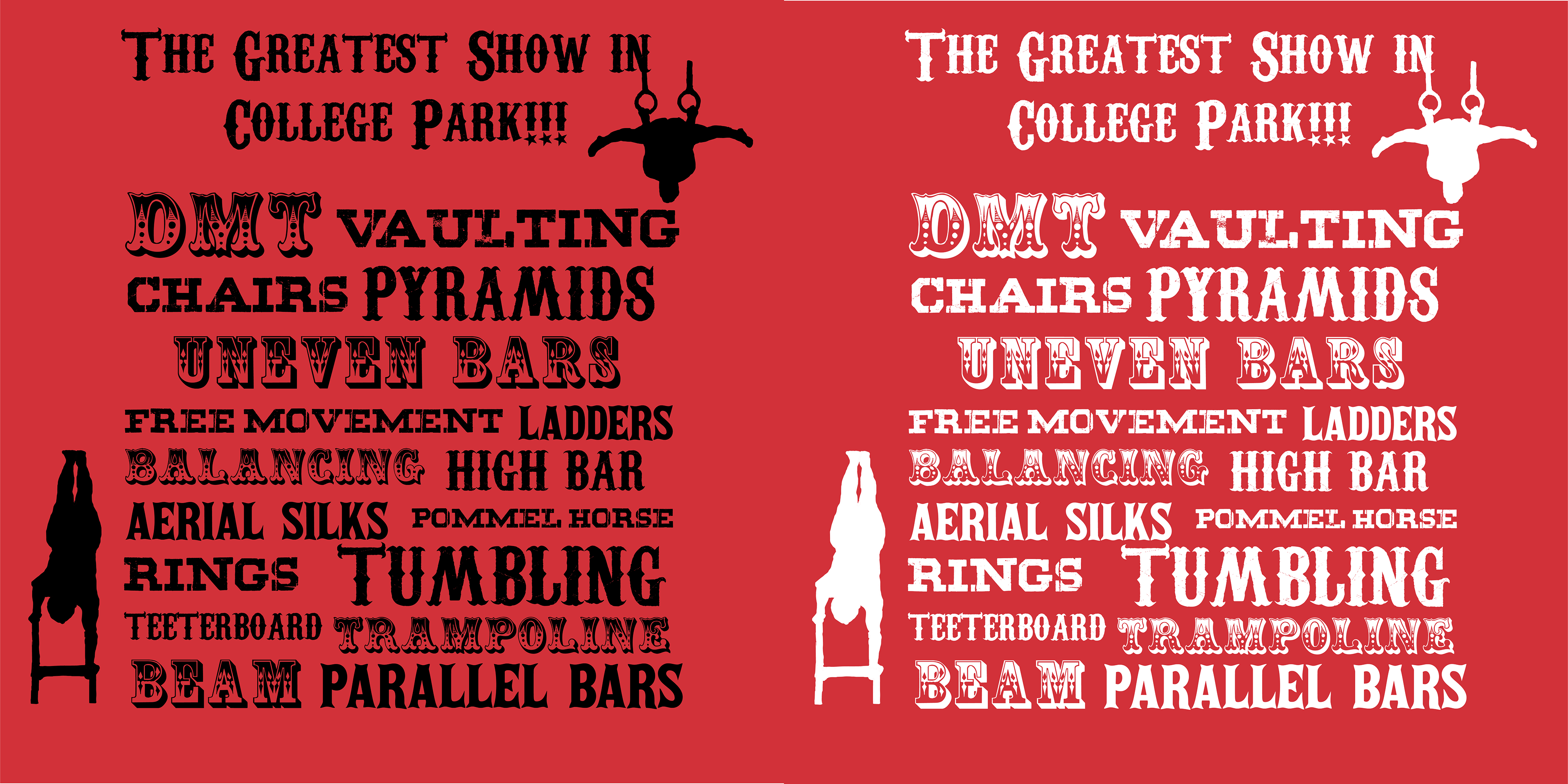
Home Show 2019 T-Shirt Designs (Back)
Phase 4: Finishing Touches!
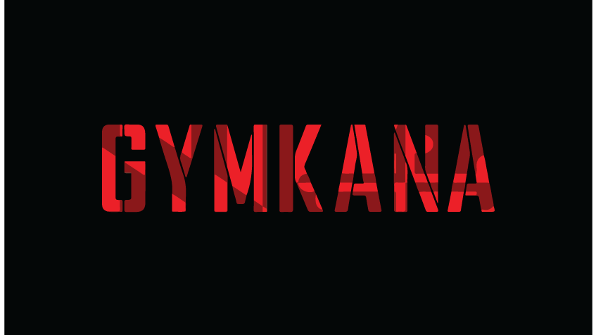
Rewinding in time a little bit; once the backdrop design was in the final draft stage, the next step was to trace and then paint the design all by hand. I had some help, of course. My friends, the other Gymkana troupe members were all able to help make the backdrop what it is by tracing the lines of the design (by projecting the outlines using a projector, and tracing with pencils). After tracing, came the painting. Some of the finer details in the original design such as the distressed marks in the "Gymkana" and the dots and streaks in "Home Show 2019" were scrapped, as these would not be as visible to the audience. The end result? Possibly one of the best and most visually appealing Gymkana backdrop designs in Gymkana's history.


